| Graphic representation of simulation results |
|---|
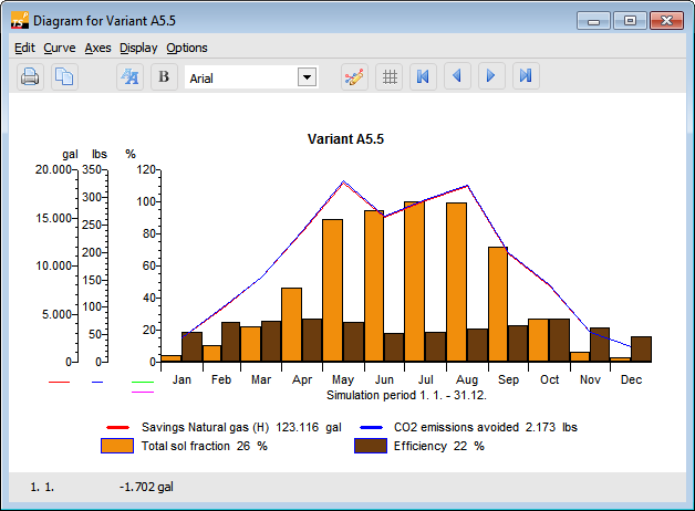
The graphics have their own menu, a toolbar, and various context menus which can be accessed by clicking the right mouse button. The symbols and the context menus are dependent on the selected object. Objects are the separate curves, the 2 axes, and the legend and title bar.
You can change the graphics display to suit your needs. A detailed description can be found in the following chapters.
A number of formatting features for the selected part of the graphics output (data record, axes) can be quickly modified with the help of the graphic symbols:
Graphics Toolbar
-
 : Click on the red arrow symbol to display the next or preceding time period (only if the display interval is smaller than a year).
 -
 : Increases and reduces the type size of the selected object (axes, title, legend).
 -
 : Toggles between normal and bold type for the selected object (axes, curve, title, legend).
 -
 : Change font for all objects.
 -
 : The selected curve toggles between line and bar display.
 -
 : The draw area is rastered in accordance with the selected axis.
 -
 : The values can be copied into other programs via the clipboard and, for example, edited in Excel.
 -
 : Send graphic to printer.
Display Period
Graphics menu: Display
Under Display, you can use Time Axes to define the period to be displayed over the time axis. You can choose from day, week, month, and year. A display of other periods (for example 2 months) can be selected under Axes / Format X-Axis.
Options
Graphics menu: Options
- Legend: here, you can choose whether or not to display the legend. \
- Title: here, you can choose whether or not to display the diagram title.
Graphics: Print
The usual Windows Printer Settings dialog appears. Here, you can select a printer and its settings.
Title
Graphics menu: Curves > Title or context menu
If you click the rectangular border in the graphics area, a dialog window opens in which you can give the graph a new title. After closing the dialog window, this title is displayed in the graphics output. Using the mouse, you can now move the title to any position within the graph area.
Curves
Graphics menu: Curves or context menu
In the Curves graphics menu, all selected data records are listed and can be formatted. The currently selected formatting is marked with a check by the menu item.
The individually displayed data records and the Y- and X-axes can also be selected in the graph by simply clicking the left mouse button on them. The selection is made clear by dots on the graph. With curves and the X-axis, you must always click below the line to select, with the Y-axis left of the axis!
If several Y-axes are displayed, the curve color of the curve it represents is shown below each Y-axis, making coordination simpler.
Double-click on the X- and Y-axis to open the Format X-Axis and Format Y-Axis dialogs.
A click with the right mouse button opens a context menu for the axes and curves with menu items for the current object.
The scaling of the axes and the position of the coordinates can be freely changed. Display interval of 1 day to 1 year. All axes and axis designations can be formatted and moved.
Own Y-axis: Allocate a further Y-axis for the selected data record. A dialog for scaling the new axis opens.
By selecting the relevant options, the curve can be presented in bold or normal type, as a line or bars.
Use Change Color to give the curve a different color.
Invisible: By selecting this, the selected curve is not drawn. The curve is not deleted but can be made visible again by selecting this option once more. At least one curve must be visible at all times.
You can also access this submenu by selecting the desired curve and clicking the right mouse button or via the symbol buttons.
X-Axis
Graphics menu Axes > X-Axis or context menu
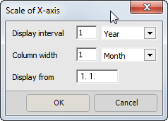
The period of time to be displayed on a diagram and over which the values of the data record should be totaled or averaged is defined in this dialog window.
Different dialogs appear here depending on whether the graph shows a representation over time or not.
-
Column width: The display period for which the data is to be summarized is defined under column width. Depending on the unit you have chosen, the values of the data record are either totaled (energy) or averaged (output, temperatures) here.
-
Display from: This is where the time point in the year at which the display of data records should begin (in date format) is entered.
-
Display interval: The period of time over which the graph should be displayed is defined under Display Interval. In addition to the time interval, with the choice of day, week, month, and year, the rate and designation of the main interval of the X-axis is also set.
Y-Axis
Graphics menu Axes> Y-Axis or context menu
Access the dialogs for scaling the axes via the Axes graphics menu, by double-clicking the axis, or via the Scaling menu which can be opened with the right mouse button when the axis is selected.
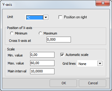
The selected Y-axis is formatted in this dialog window.
- Unit: here, select the unit in which the Y-axis and its associated curves are to be displayed. If you select the Position on Right box, the Y-axis is positioned on the right-hand side of the diagram.
- Position of X-axis: this is where you define the intersection point of the X-axis and Y-axis. If you select Minimum, the X-axis is drawn at the bottom edge of the Y-axis. On the other hand, if you select Maximum, the X-axis is drawn at the top of the Y-axis. If you want to freely define the position of the X-axis, enter the desired Y-value in the Cross X-Axis At field.
- Scaling automatic: if this field is selected, the axis is scaled independently of the entries below using the minimum and maximum values of the Y-axis curves. If the X-axis display interval is changed, the scaling is updated.
- If the following scaling values are modified, automatic scaling is immediately deactivated. If this is the case, the entered scaling applies to all display intervals of the X-axis. This is especially useful for quick comparison of different display intervals.
- Min. Value: the minimum value to be displayed is entered in the currently selected unit.
- Max. Value: the maximum value to be displayed is entered in the currently selected unit.
- Main Interval: definition of the labeled intervals. The interval is entered in the currently selected unit.
- Sub-Interval: definition of subdivision of main intervals. The interval is entered in the currently selected unit.
- Grid Lines: dotted or continuous lines are drawn at the level of the main interval.
Legend
Graphics menu: Curves > Legend or context menu
All the displayed data records are assigned to their respective representation in the legend.
If energy is displayed, the sum of energy in the presented period of time is shown after the respective data record name.
If power, temperatures, wind speed, and evaluation parameters (fraction, efficiency) are displayed, the average values are shown in the presented period.
The legend field can be selected and moved.
Coordinates Field
The bottom bar of the graphics output contains a field with the current coordinates when the cursor is within the diagram. The date and time as well as the associated X-value of the cursor position are displayed.


