Diagram editor
To access the Diagram Editor, click in the tree directory of the results page.
Each displayed diagram can be added to the presentation using the corresponding button Add to presentation
![]() . If you would like an overview of all diagrams added to the presentation, click on Diagrams in the presentation
. If you would like an overview of all diagrams added to the presentation, click on Diagrams in the presentation
![]() .
Three types of diagrams are available for visualizing the simulation results:
.
Three types of diagrams are available for visualizing the simulation results:
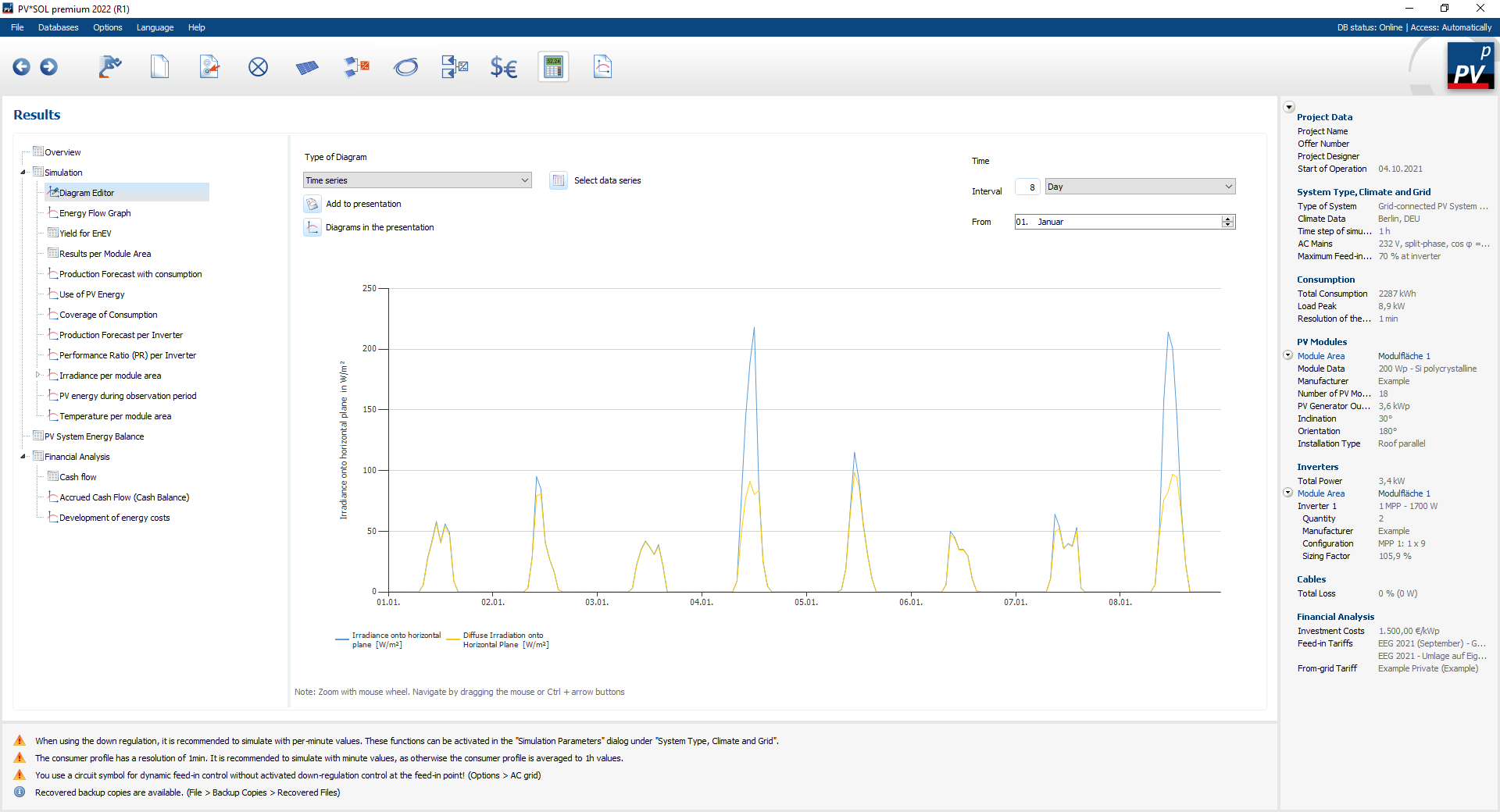
Time series
localized
Here different simulation results are plotted over time.
You can decide which size you want to display using the Select data series
 button.
You can set the display interval and the start and end time under time.
If you move the mouse over the diagram, the corresponding values are displayed below the diagram.
button.
You can set the display interval and the start and end time under time.
If you move the mouse over the diagram, the corresponding values are displayed below the diagram.
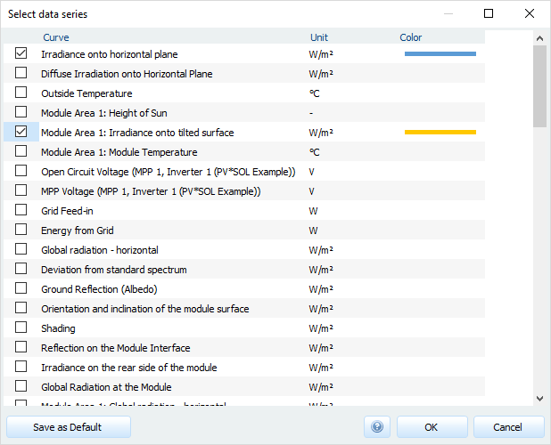
Select data series
The data series to be displayed are defined in the select data series
dialogue.
The colors of the data points can be adjusted individually.
You can also save your selection as a default.
Dialogue: Select data series
Please note that only data with a maximum of two different units can be displayed simultaneously.
Carpet Plot
The result display with carpet plots is particularly helpful for presenting large amounts of data clearly and for determining behavior patterns at a glance. As an example, the losses and gains due to the low light behaviour of the PV modules are visualized in hourly averages. If you require a higher resolution, simulate with synthesized minute values.
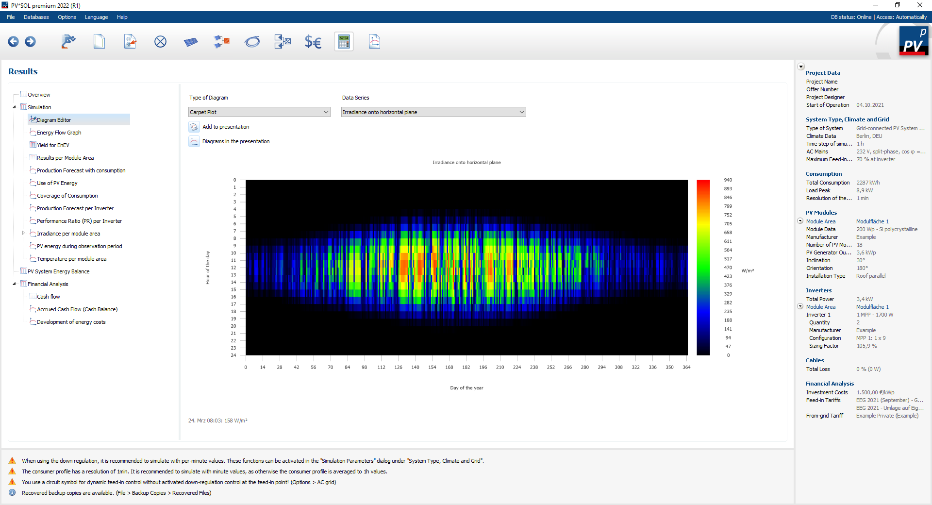
The abscissa shows the days of the year from 0 to 365, the ordinate the hours of the day from 0 to 24.
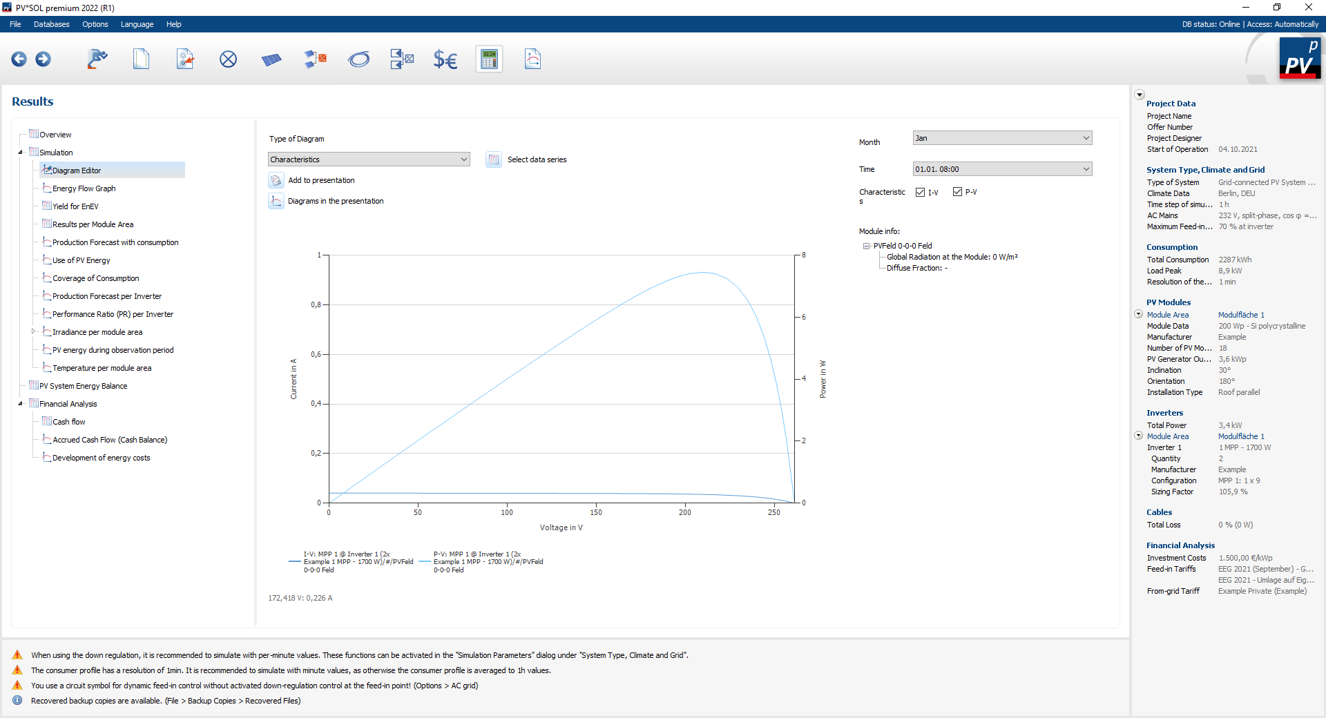
Characteristic curves
The result display of the characteristic curves is interesting if you want to gain a better understanding of the module behavior or the MPP trackers. You can visualize the current-voltage characteristics and the power-voltage characteristics for each time step.